
2. Linear workflow with color depth and color adjustments – Part I
c. Integrate two pictures from different sources.
This part of the tutorial will give you the steps you will have to use in order to match the color values and light between two images that came from different sources. All the work will be done in Photoshop. This is a daily routine in a Matte Paint Department.
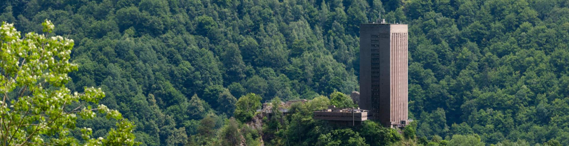
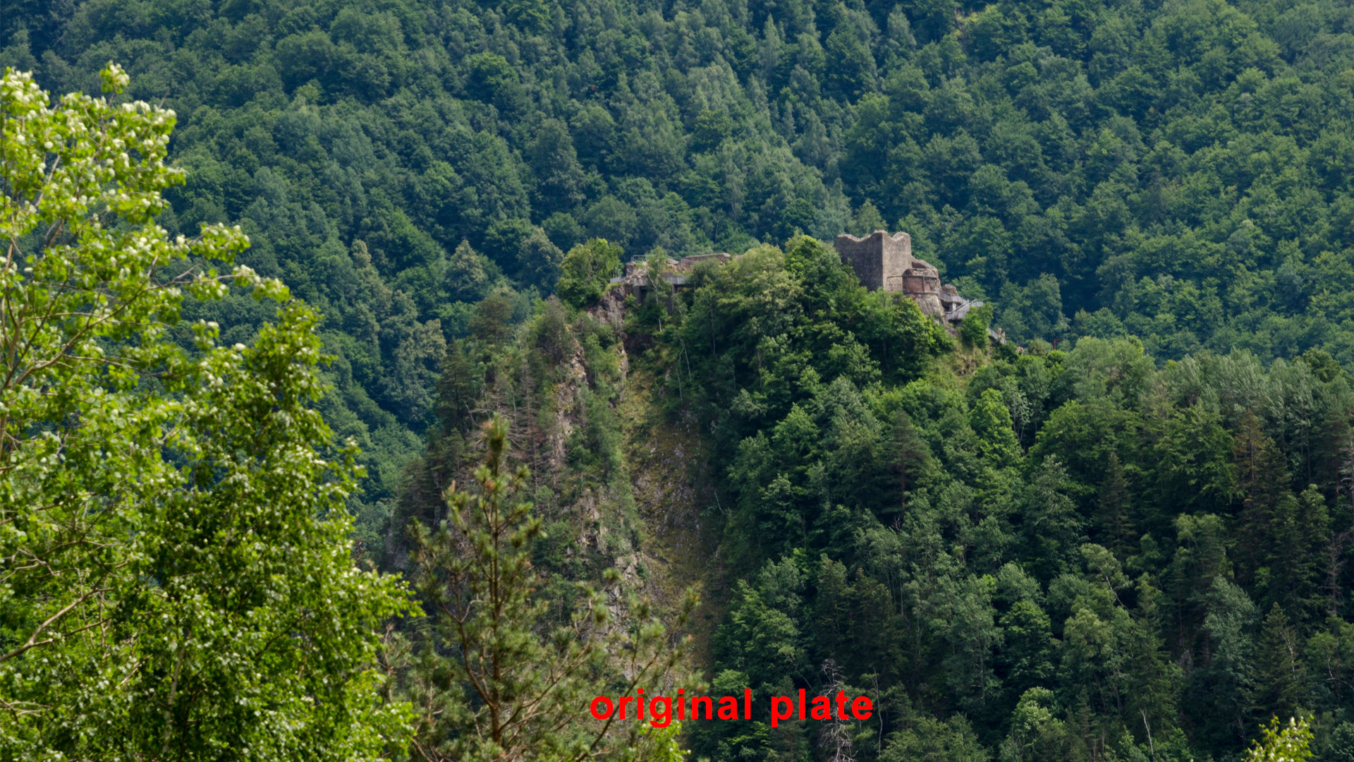
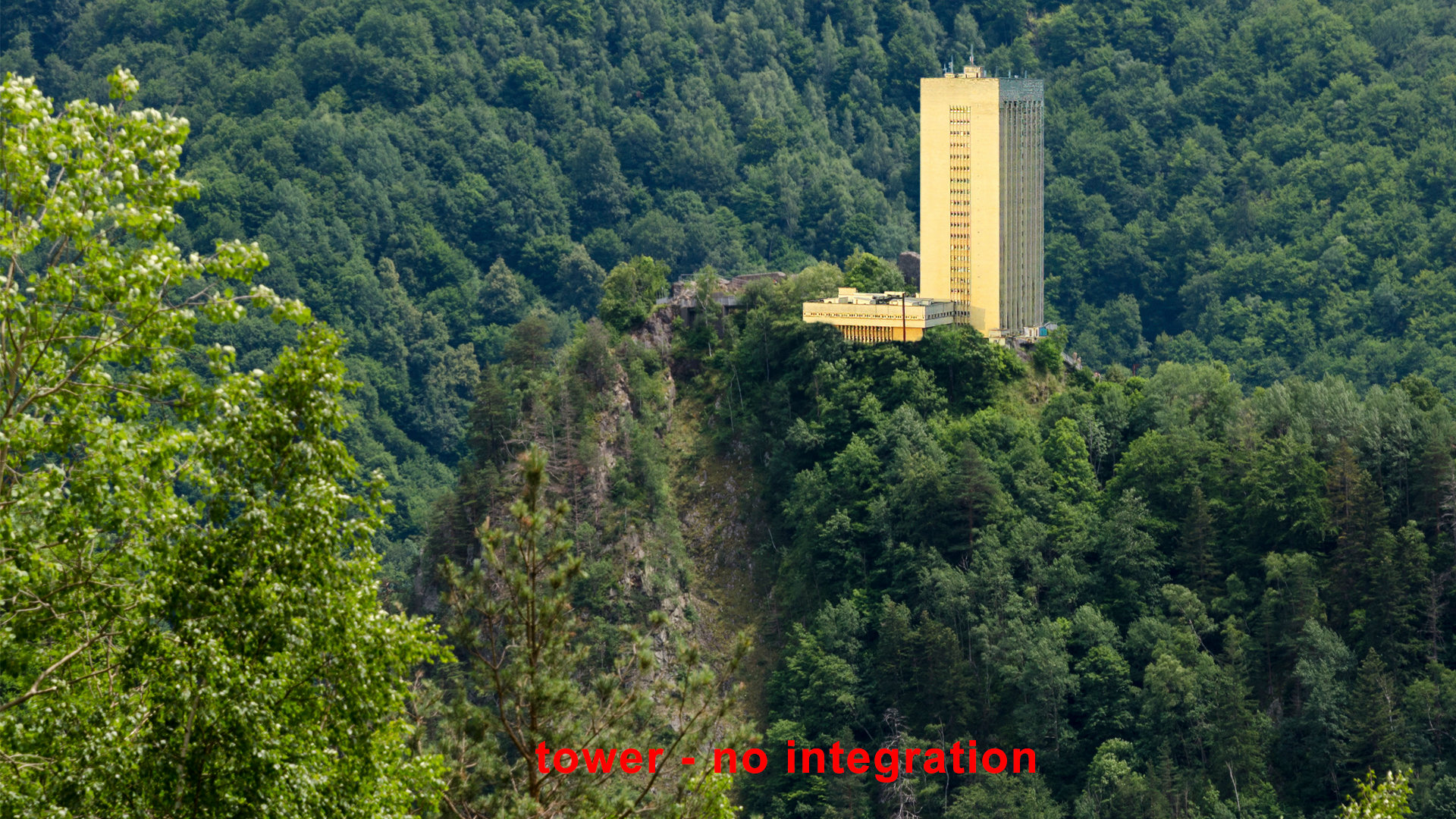
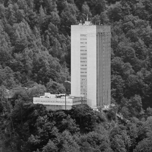
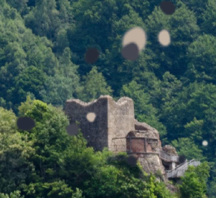
I have the image bellow where, for whatever reasons, we have to overlap the tower over the fortress and integrate it with the background.
You can notice that the tower has not just a different light angle but also different values for bright and dark, compared to the background. For this exercise let’s assume that the background will be our image to follow (client plate) for the light and color values.
Images analysis
– light on the plate is casted from the right side, while on the overlapped tower is inverted.
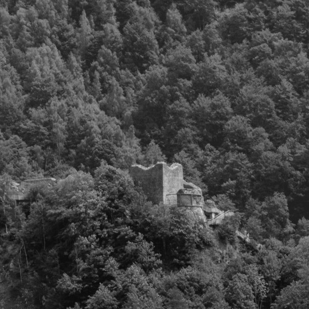
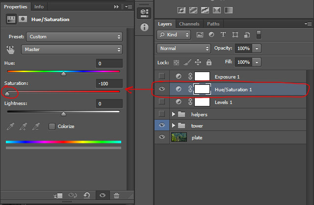
–bright and dark values – if you use a Hue/Saturation layer in Photoshop, you can see the Tower’s bright values are brighter compared with the rocks on the fortress from the original image. See the images bellow:
–color values on the tower are yellowish and off, compared with the background (remember, we have to match the tower to the background).
– sharpen or blurriness of the original plate, have to be match too.
– refining – will be the extra layers of paint where you can add few extra bits that will give consistency to your painting. Here you can add any color adjustment or painting layers that you feel will give that extra refinement to you painting.
Note: The above steps are the key elements to which you have to pay attention, while two or multiple elements are integrated. For this exercise I want to focus on color grading so I omitted the perspective match with the plate. This will be the first thing you should have in mind. The approach on how to match a correct perspective, I will cover it in Chapter 3.
Let’s continue with the practical exercise. The steps used to integrate the tower, are a very common workflow, but feel free to explore other ways too. By default I worked in 16bits and the resolution is full HD.
You can either use those two images for the exercise or you can find your own. The images are under the ref folder.
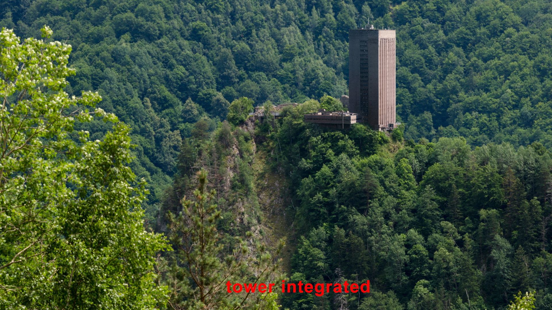
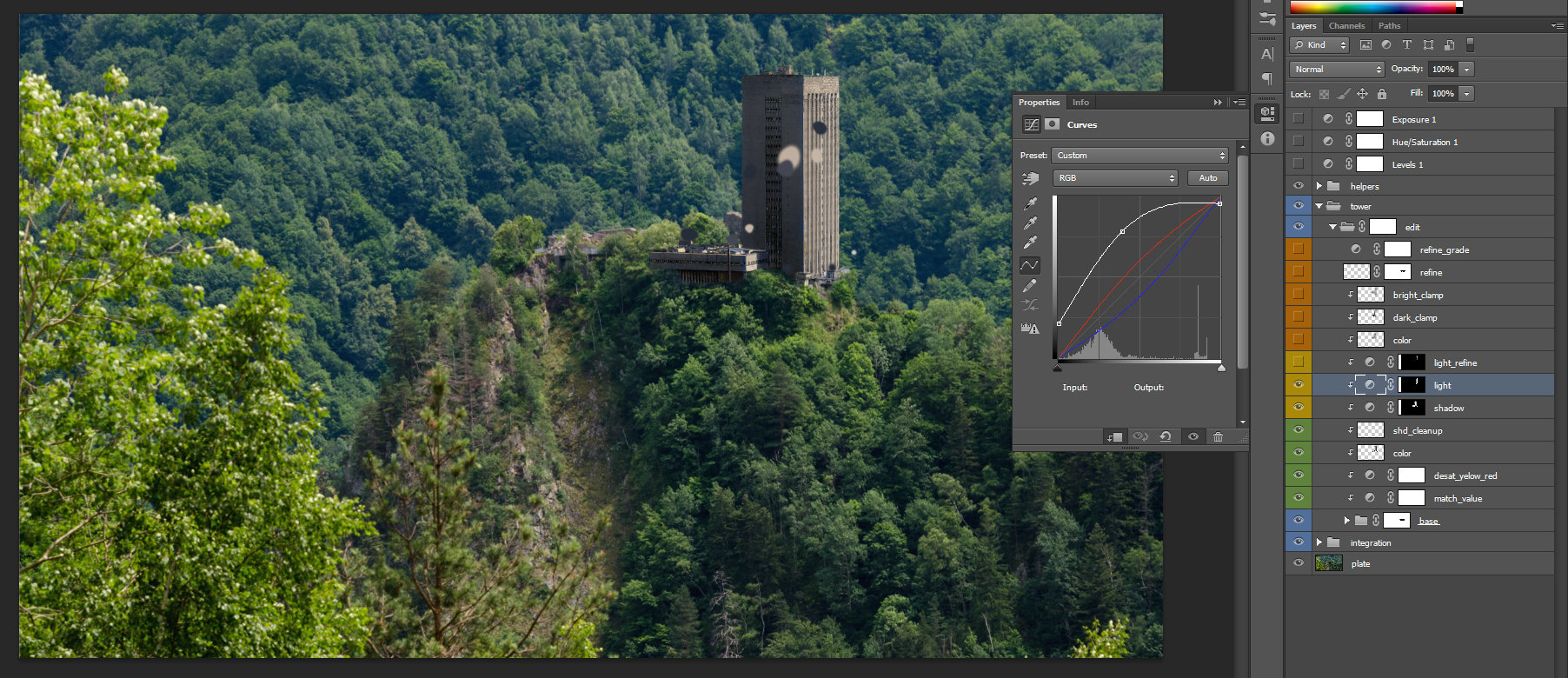
Here is the final image integrated side by side with the original plate. I will pass through each layer to explain it.
Matching the global values with the plate.
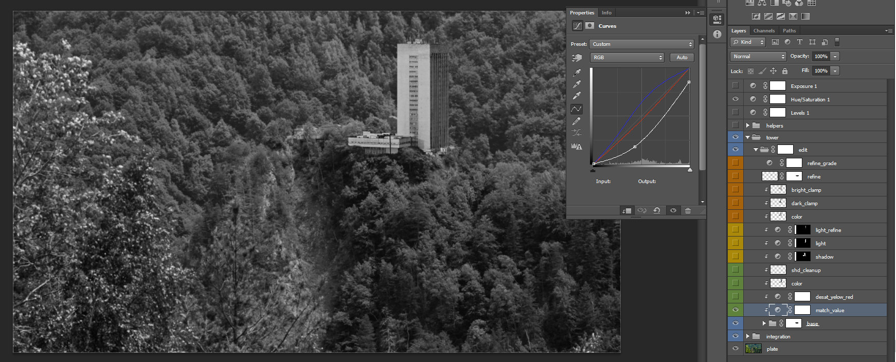
 match_values – match the dark and bright values with the plate, the bright point is pushed down (clamped).
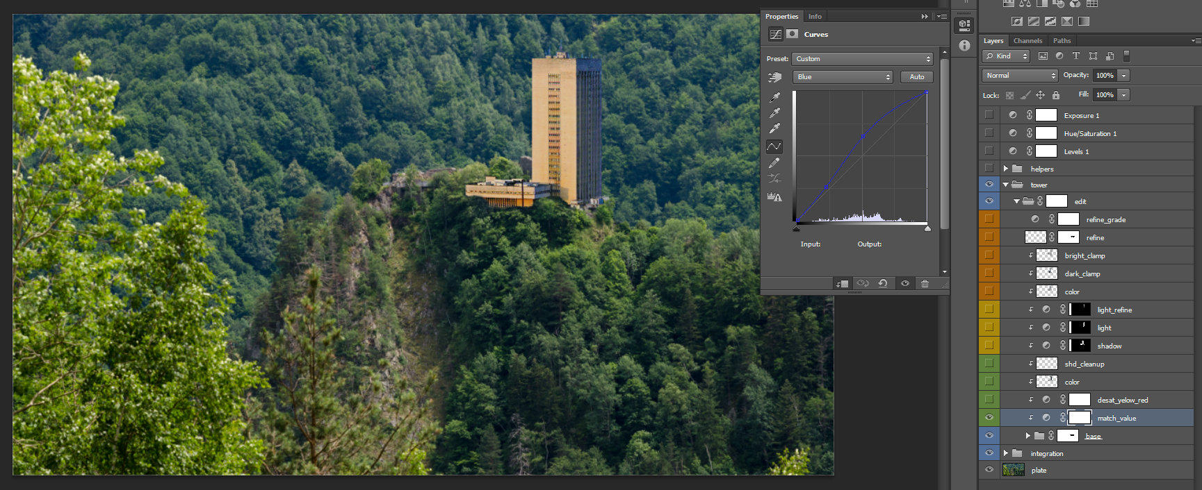
 We use the Hue/Saturation layer, from the top, to check if the Tower’s black and white are matching correctly. Additionally I did some adjustments on the Red, Green and Blue curves too, of the match_value’s parameter. This is a very rough matching, try to see it like a starting point. I will refine everything step by step. You can also turn on the Exposure and push the exposure value up and down to see if the values are matching correctly. We use the Exposure to be sure that the values are correct at all levels of brightness or dark.
Note: Use the Exposure and Hue/saturation layers to check every adjustment that you add. The values should be uniform at all levels of brightness or dark.
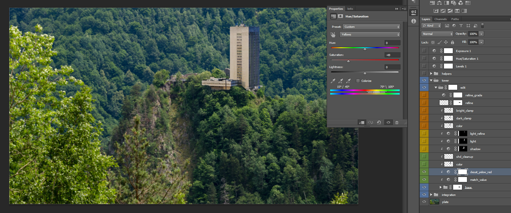 desat_yello_red – Hue /saturation layer I use it to desaturate the yellow and the red channel. This is because the first layer curve created did not offer me a complete solution.
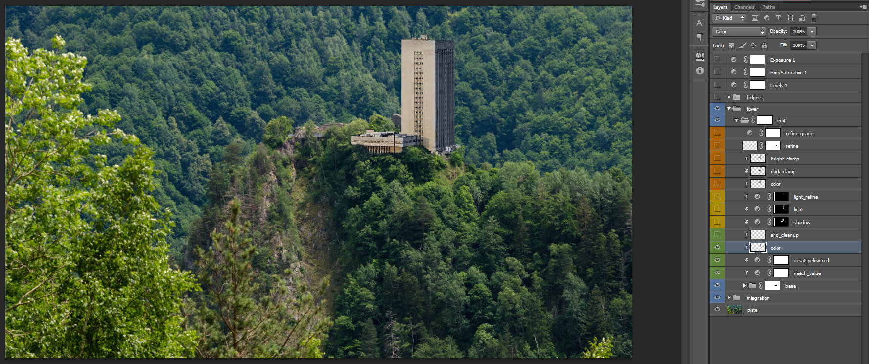 color – I use a normal layer on color blending mode. This is to tone down the blue values at the top of the building.
Note: use color blending mode of a layer to tint the color of the layer/s bellow it. You can also use the brush with a color blending mode, to get the same result, but be aware that this method will not be reversible.
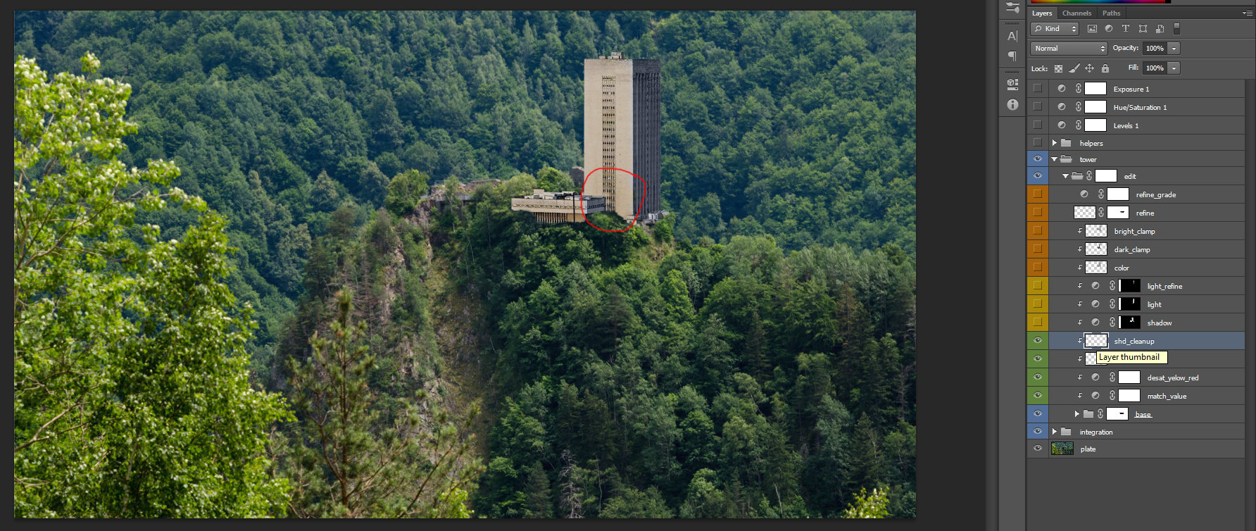 shd_cleanup – with the clone stamp tool I removed the casted shadow, from the circled area, on the image. You can use the brush tool too, or any technique, that will be suitable for reaching the intended goal.
 This is because I will have to swap the shadow and light for this building.
Note: Up to this stage of grading, I just try to integrate the values to match the plate. I also clean up the tower in order to prepare it for the paint of shadow and light.
Matching shadow and light with the plate.
 In order to match the shadow and light values and direction, I move back to the original plate and take, with the Picker tool, values of the shadow and light. I then, place the values in different areas, on the new layer, so I can use them as reference. Once you match the values for a layer, don’t forget to check the saturation, desaturation, exposure by pushing up and down the values, so they are integrated with plate.
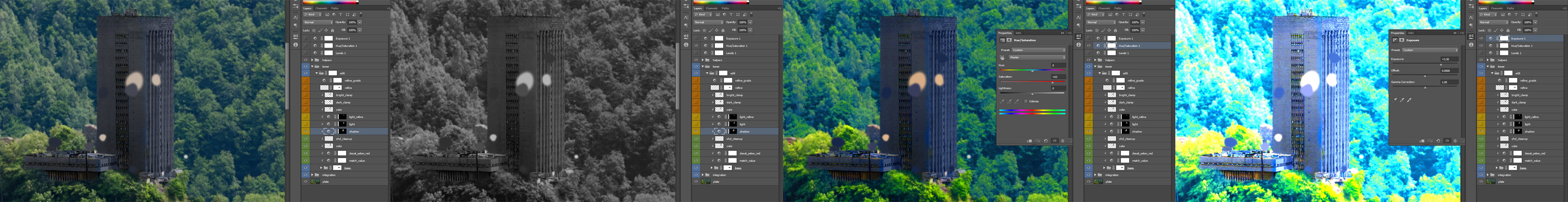
Note: Initially I match the building shadow with its own values. Later on, I will add extra layers for refinement, so it will integrate better with the plate values.
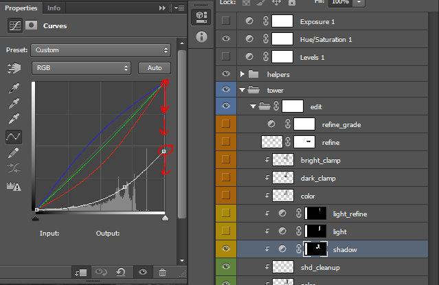 shadow – select the top layer for Hue/Saturation and turned the saturation to -100 (desaturate the image until is black and white).
– return to the curve layer and push down the white and black values until the tones are matching with the plate. Your curve should look like in the image in the left side. Additionally you can create a point in the middle to recovering some contrast.
– once the dark and bright values on the RGB curve are set, you can move to the red, green and blue (channels) curves, in order to match the color of the shadow.
–at the point where your shadow values look integrated, fill the curve’s mask with black and start to paint on the mask the areas that needs the shadow.
This method is very consistent because you keep as much as possible from the actual details and add color depth to your painted layer.
Personal note: I will not recommend using more than three dots in-between, because that will create color aberrations. You have to check from case to case, but just to keep in mind. Normally you will use two dots in-between, one for dark and another extra for bright values. These can be applied on the curves representing the channels red, green and blue.
 light – I use the same setting I used for shadow. In this case I lift the black and I also lift the values in between too. You can see the curve. Once the dark and bright values were set to match I adjust the color of the light from the RGB curves.
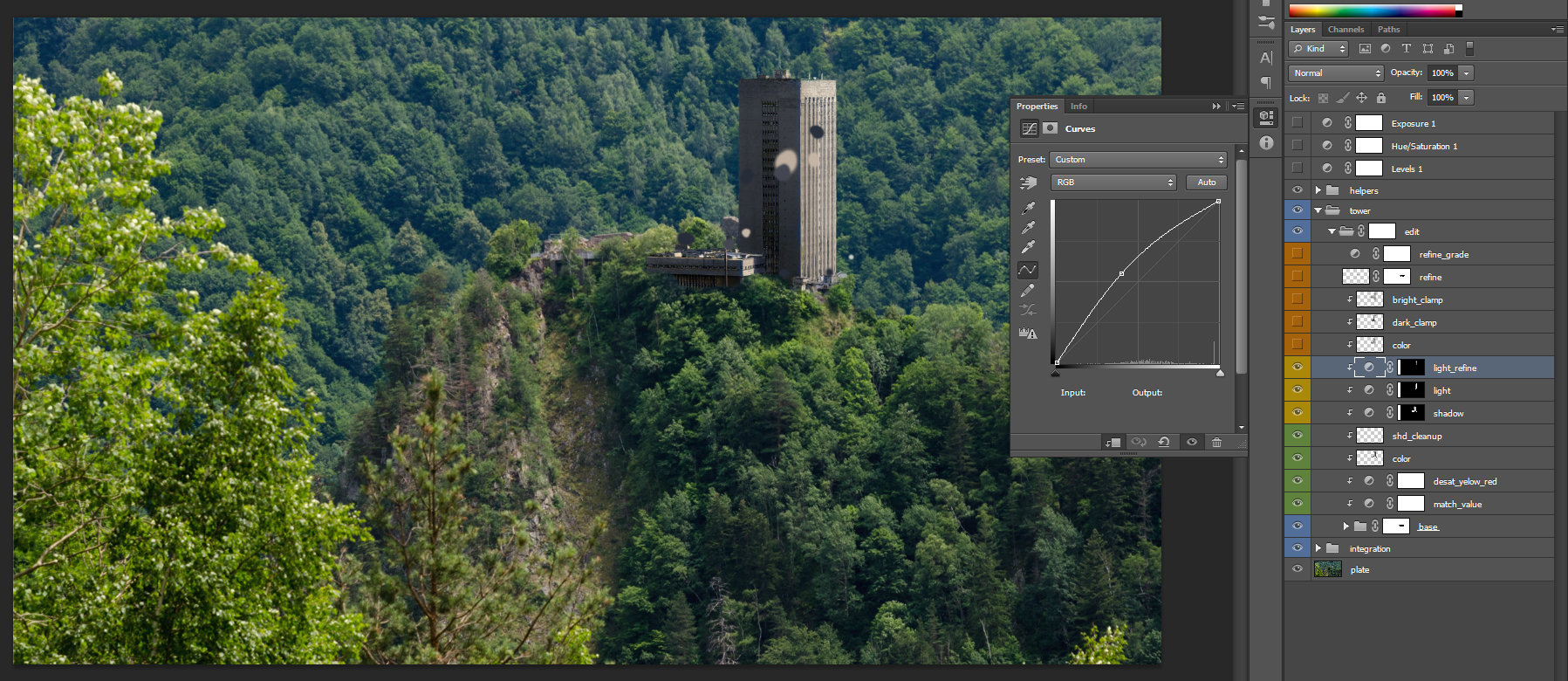 light_refine – this curve I use it to add extra refinement to the light.
 Adding final layers fore subtle details.
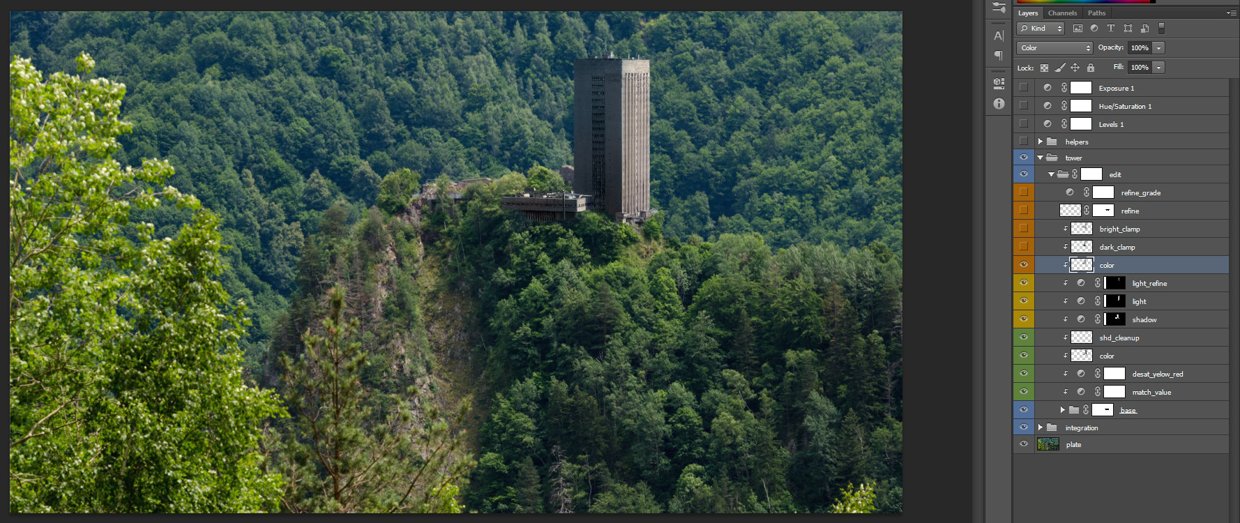 color – normal layer on color blending mode. I used this to refine the integration of the building.
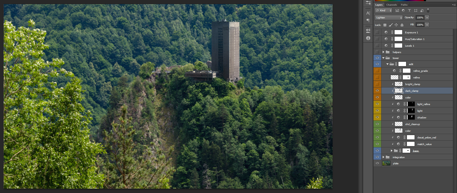 dark_clamp – normal layer on Lighten blending mode. I used this to refine the darks values on the building.
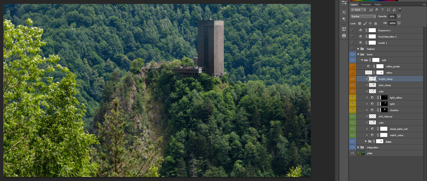 bright_clamp – normal layer on Darken blending mode. I used this to refine the bright values on the building.
 refine – normal layer on Normal blending mode. I used this to hand paint some spots in order to increase the quality of our painted layer. The mask applied is to refine the amount of my paint.
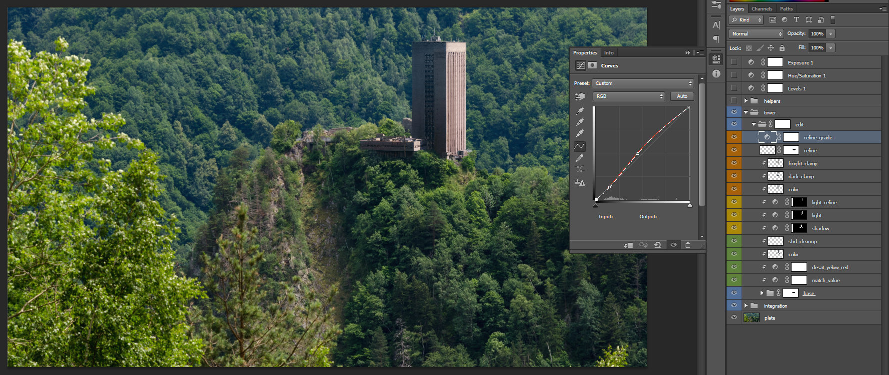 refine_grade – curve adjustment used to add the final tweaking.
For the final Integration I added another folder group, called Integration, to paint the shadow around the building.
Here we end the first part of the second chapter. In the second part, we will talk about grading in Nuke.